
K.I.T App
(Keep In Touch)
Across different timezones and locations, KIT helps you maintain the relationships that matter the most.
Overview
Role
Product Designer
Tools
Figma, Miro
Deliverables
User Research, User Personas, User Stories, Red Routes, Sketches, Wireframes, Style KIT, High Fidelity Screens, Prototype
Timeline
3 Months
(NOV 22- JAN 23)
Problem
As our lives grow busy and more global, we are often physically apart from some of our closest family and friends. The routines that once allowed us to connect and brought us together, such as cohabitation, attending school, or working together, may no longer be feasible. As a result those relationships now require intentional and consistent effort to be maintained.
Goals
Help users remember to reach out to loved ones
Make it simpler for users to find times when everyone is free so catching up requires less effort
Create a quick way for users to see who they haven’t spoken to in a while, and who they should reach out to
My Solution
Automated Reminders
Add your friends on KIT and start setting reminders for how often you would like to connect with them
Scheduling Assistant
Use the scheduling wizard to find the best options for times to catch up based on availability

Dashboard Overview
Check the dashboard to have an overview of upcoming important events and reminders
MY DESIGN PROCESS


01 . DISCOVER
02 . DEFINE


04 . DESIGN
03 . IDEATE
Before designing, I focused on understanding the problem space and gathering data. I leveraged secondary research (scholarly literature) to give me a broader understanding of the problem space and conducted primary research (survey and Interviews) to get a deeper understanding of the nuances faced by users.
01
Discover - Understanding the problem
Secondary Research
During the pandemic, loneliness in America skyrocketed, with a report suggesting 36% of all Americans feel “serious loneliness”. A clear correlation exists between not connecting with loved ones and feeling lonely. More people are moving away from their loved ones to pursue schooling, careers, and other opportunities. Research confirms that there is a strain on relationships once they become long-distance.
User Surveys
My priority with the surveys was to understand the target audience and their challenges with maintaining relationships. I created and shared the survey and received 70+ responses. Based on these, I was able to validate my problem statement as well as identify
2 main user pain points
- time zone differences & requiring extra intentionality.
Interviews
Next, I conducted 7 user interviews. I prepared a script with 15 open-ended questions, diving deeper into my target audiences’ frustrations, motivations, and how they liked to connect. This helped me figure out the nuances and detail of the problem space and allowed me to get a clear picture of the different types of potential users.
User Personas
Finally, I created three distinct User personas who each had slightly different needs when it came to keeping in touch. I choose to focus on the user “Spontaneous Shivani” for this project as her needs were the common denominator for the majority of the users I interviewed.

Key Themes from Research
Users’ desire to keep in touch vs their ability to keep in touch do not correlate, suggesting there is friction in the current ways they maintain their relationships.
The mental load of “remembering” to reach out is one of the biggest reasons users struggle
Manually scheduling group calls with friends and loved ones is extremely difficult given various timezones and schedules, resulting in users giving up after a few attempts.
As a designer, How might I …
Help users build sustainable and integrated routines to connect with and maintain their long-distance relationships.
Make the experience of connecting virtually feel more fun and organic.
Help users feel more connected with and build deeper relationships with people they live far away from.
02
Define - Figuring out what success looks like
User Stories + Prioritizations
Coming out of my discovery phase, I had gathered enough data to create many different user stories. To be able to start thinking of an MVP I categorized the user stories by priority of user needs and simplicity.
1 - NOW (MVP)
Success Metrics
Now that I had my MVP, I came up with ways to measure whether my design would be successful in meeting the users’ needs.
Increase in the number of times the user reaches out to a friend or loved one
Decrease in time and effort spent planning “catch-ups” with groups with different timezones and schedules
Overall user satisfaction and feeling of being more connected to their social networks
03
Ideate - Exploring potential solutions
User Flows
I started my ideation phase by creating user flows, which mapped out the path a user would follow to complete the most important function of the app.

Schedule a call
Sketches
Next, using my user flows as my guide, I began to think about different parts of my app and how they might be organized most efficiently. I started to sketch out rough ideas of how the screen could look and how users might interact with them.

Schedule an event
04
Design - Building the Product
Style Guide
I wanted the app to feel gentle and friendly so that users’ experience interacting with the app felt organic, easy, and unstrained. To achieve this I choose to use :
A cheerful typeface for headings
A clean typeface for body text
Slightly rounded shapes for my components
Soothing greens for the color story
Delicate and simple line Icons

Wireframes
Using Figma, I translated my sketches into low-fidelity wireframes. This process helped me work out the structure and content for my critical screens. This also allowed me to validate the functionality of my app.

Daily quote about friendship + upcoming events
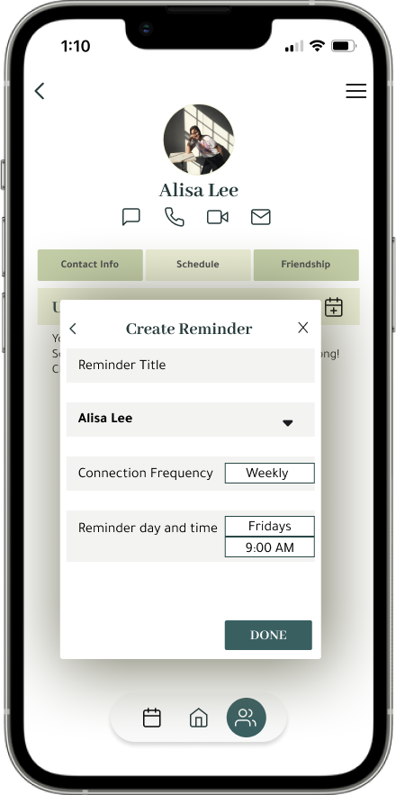
Creating A Reminder

Insights
Simplify the “type of connections”. It is not clear what the difference is between a Catch-up and an Event
Make a wizard for creating reminders/events, so you can see where you are within the app, and navigate easily.
Friend Profile
CRITICAL SCREENS
ADD FRIEND

See upcoming events from a monthly view + add events


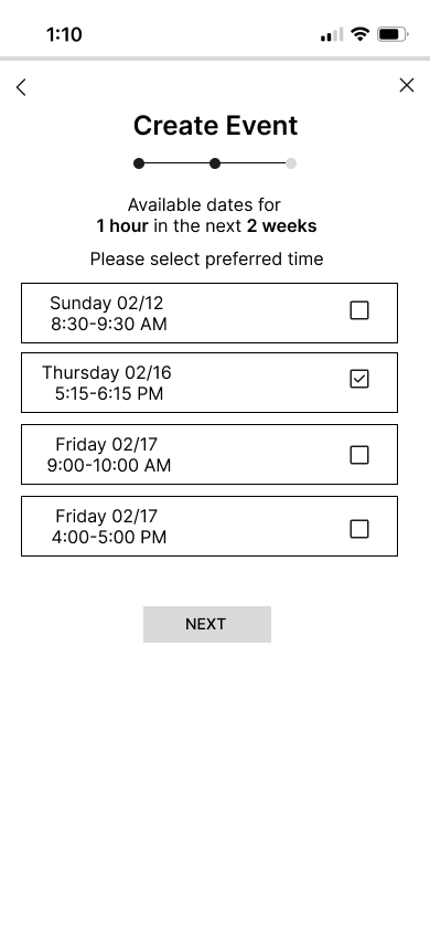
Find shared time with your friend based on their availability

Updates


Updates

Add friends, accept requests and see friend suggestions

Create an event or reminder to connect with your friends
User Testing
At this stage, the wireframes were defined enough for some user testing. I conducted 3 moderated usability tests where I asked users to complete several tasks to stimulate user flows. This proved very helpful in streamlining and simplifying my designs. Based on the feedback I received I made a few revisions and moved on to creating high-fidelity prototypes.
EVENT WIZARD
FRIEND PROFILE

See all contact info about friend, upcoming meetings and shared notes
SCHEDULING ASSISTANT
Tabs are clear and understandable
Minimal color and cleaner design, so user is not overwhelmed and can navigate more easily
Create Event
Simplified to 2 options, and added icons for further clarification.
Designed a wizard for creating reminders/events. Unnecessary screens avoided
Insights
Make sure the different profile sections (Contact info, Schedule, Friendship) look like tabs, not buttons.
No need for so many background boxes. Looks cluttered and distracting
Add Contact
Check Reminder
Final Thoughts and Reflections
I am very excited to have completed designing my first-ever, start-to-finish product. Throughout this process, I’ve truly learned the guiding principles of product design starting from user research, to identifying a problem, to coming up with and designing a viable solution. In these three months my biggest takeaways have been :
The Power of Listening to your user - From the start, staying curious and engaged with my users and their frustrations paved the way for so much exploration and learning. Even once I had started to design solutions, checking in with users and doing usability tests guided my whole process forward.
The Power of simple design - As this was the first thing I’ve designed, I found it challenging to make my ideas and solutions look sophisticated and modern. I realized that understanding the rules of design was key and I began looking to leaders in the industry for inspiration. This helped me a lot, and I was able to take my colorful cluttered initial designs to a cleaner end state.
Progress not perfection - Having to push through moments where I truly was not confident in my designs showed me that it’s not always possible to get the perfect design from day 1, but by progressing and moving forward, I was able to learn so much that I then applied back to my work.
Overall I’m proud of what I have created and am excited to continue to grow as I work on more projects.