
An app to find cafes to work at that best fits your needs - wherever, whenever
Context
Freelance and remote work is here to stay. The need for public places that also function as workplaces has grown. Workers cannot always take calls or work in silence in their homes and often look for alternative locations to get work done. Many of these workers rely on public spaces like Cafes, where they may not be interrupted and may be more motivated to work.
Overview
Role
UI/UX Designer
Tools
Figma, Miro
Deliverables
Sketches, High Fidelity Screens, Usability testing
Timeline
5 day design sprint
Problem Statement
Freelance and remote workers struggle to find suitable public places to work from that are close to their location and meet their specific workplace requirements. This results in more time spent searching for workspaces instead of being productive.
Goals
A quick and convenient way to find places to work close to you
A simple way to find places that best match your specific workplace needs
Design Sprint Process

DAY 1 : Understand and Map
User Research
I began by reviewing the research provided. I looked at several user interviews, a user persona, and a video describing how a remote worker currently finds places to “post-up” and work. I then synthesized my learning into user needs and pain points.
User Pain Points
Time-consuming: the current process of finding places ends up taking too much time
Reviews not work-specific: current review sites don’t address workplace concerns
Difficult to find amenities: unable to figure out whether a location is “worker-friendly”
Workplace Amenities: having access to stable wifi, power outlets, bathrooms, and coffee
Noise level/ capacity: knowing the location will not be too noisy or crowded to work
Location: finding spaces that meet workplace needs that are close by
Reframing The Problem
I realized that the biggest issue in the current process was that the user was having to manually search for information and compare locations (which was very time-consuming) to be able to pick a place that would fit their needs. With that in mind, I came up with my problem to solve :
“ How might we make the process of finding a place that best matches your workplace needs quicker and simpler? “
User Journey Map
Open app and input location
Select filters that match workplace needs
User Needs
Compare nearby options, ranked by how well they match workplace needs
Decide and select location
Route to the selected location
DAY 2 - Sketch a Solution
Once I had understood the user's pain point and needs, I began sketching. I thought of different features that would help solve the user’s problems and tried to implement them in my sketches. Some of my ideas were:
Map - To show the user’s current location and potential nearby places to work
Filter - So that the user could choose what their work needs were and find a place that satisfied them
Image carousel/gallery - So users could see their options at a glance and compare
Crazy Eight Sketches
To generate a variety of ideas quickly, I did a crazy 8 exercise, where I sketches out 8 different potential screens for the POST UP app. I tried to incorporate the elements I identified above, but also let my creativity run wild. I ended up with maybe different ideas and interesting ideas to choose from.

DAY 3 - Decide
It was time to prioritize and decide which sketch from day 2 would be the best solution.
In sketches 4 and 6 I incorporated a map showing the user’s location and places nearby that the user could work at. I decided this was an important feature to have in the final design as the location was very key to the users when choosing a location
in sketch 5 I had a “Choose Amenities” section, which I also wanted to incorporate into the final design. By allowing users to filter locations by their specific needs, I could solve their current issue of spending time manually searching whether or not the location would be appropriate for them.
Wireframes
Based on the different elements in my sketches, I created wireframes for my critical screens, figuring out the general layout and structure of my app.
Onboarding Screen

A scroll-though introduction to explain the functionality of the app to new users
Filters

The filters page, which includes all the important related amenities I gathered from the user research
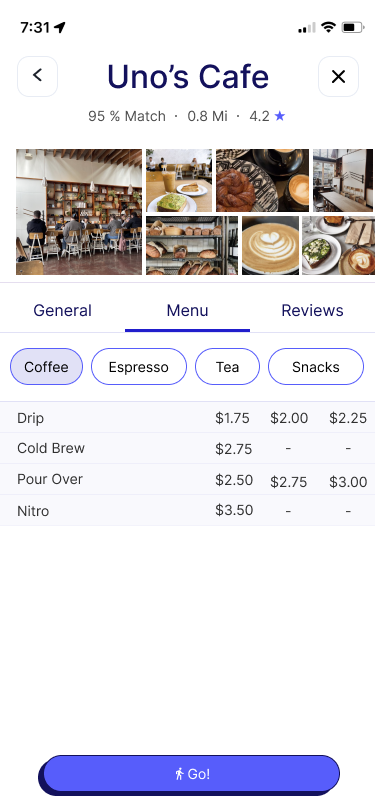
Dashboard
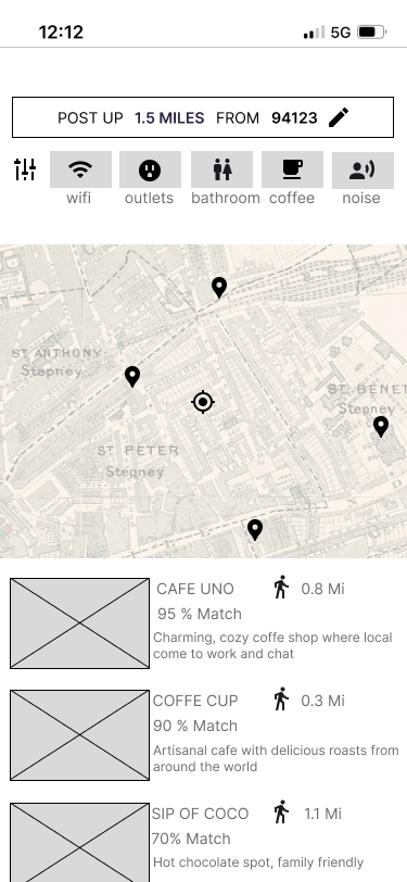
The dashboard, that shows you the map of where you are, and what is close by. Places near you are ranked according to your preferences
DAY 4 - Prototype
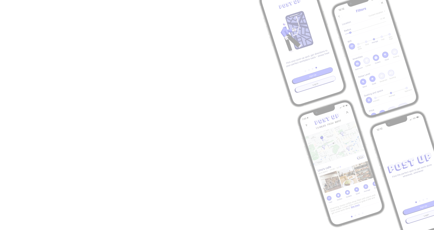
High fidelity screens
Once I had my wireframes completed, I moved on to creating my high-fidelity screens for the user flow. I decided to choose a digital blue hue as my main color. I chose this color as I wanted to show that the app helps users find cafes to work, rather than helping users find cafes to eat. I also incorporated some bold shadow elements, and fun illustrations to give a sense of playfulness to the app.
ONBOARDING


SIGN UP/LOGIN

DASHBOARD


LOCATION INFO


FILTERS

DIRECTIONS

DAY 5 - Test & Validate
Finally, I conducted 5 remote moderated usability tests. I asked users to walk through the user flow of choosing a location to work at based on their specific needs. Overall, all the users found the experience quite intuitive and easy to navigate. They were able to complete the task within 3-4 minutes and some even expressed enjoyment during the process! There was some minor feedback from the users, but generally, I received positive responses.
“What if I don’t want to walk to a place to work, and I want to drive? Is there a way to search for places further away and get driving directions? ” - User 1
“Are there options to work close to me that are not cafes? I’d like to have the option to work at all available public spaces, like parks or libraries" - User 3
In the next iteration of POST UP, I would like to broaden the locations where users can work to include different types of public areas. This would require adjusting the filters to accommodate different types of locations but would provide more options for remote and freelance workers to get work done. I would also include other modes of transport such are cars, bikes, and public transport. This would help make the app more accessible to all users.
Final Thoughts
I thoroughly enjoyed working on this design sprint. Being on such a tight timeline forced me to make executive designs and keep moving forward, something that can otherwise be tricky for me! I found that I was able to rise to the challenge, and exceeded my expectations during this process. I also enjoyed being a little more playful and experimental with the style and aesthetic of Post Up and I believe it added to the overall experience of using the app. Overall I was able to try fast and fail fast, which showed me that “failing“ was a great teacher as I was forced to pivot and adapt to the challenge!