SmartID
powered by Shoptaki

Designing an app for Universal Identity Managment
PROJECT OVERVIEW
Role
UI/UX Designer
Responsibilities
Analysis of the current experience
Competitor analysis
Style Guide
Clickable High-fidelity prototype
Tools
Figma
Timeline
3-month Contract
(March-May 2023)
THE CLIENT
Shoptaki is a start-up leveraging AI and blockchain to solve problems related to authentication. Their product, SmartID, is a universal identity that shares information between organizations and can quickly and securely authenticate users.
THE PROBLEM
The current designs of SmartID were incomplete and disconnected, making the user’s ability to navigate through the app and use the universal identity extremely difficult and confusing.
THE OPPORTUNITY
My team and I were tasked with improving the user experience by re-designing the app, specifically :
Onboarding flow
Document Upload flow
Dashboard
Setting and Permission
Finance flows
The application was feature-heavy, so we focused on simplifying the users’ journey by looking at each interaction at each stage.
We also created a comprehensive design system by integrating the positive elements of all the previous designs, resulting in a cohesive and clean final design.
REDESIGN PROCESS
1
Understand The Product
2
Analyze The Current Experience
3
Design A Better Product
UNDERSTANDING THE PRODUCT
Our team did a competitive analysis of two companies, ClearMe and ID.me, that are currently leading the identity space.
Common Strengths of Digital IDs
Reduces friction where identity verification is required
Easier to manage digital IDs than keep track of all physical documents
More secure and private than physical IDs
Common Weakness of Digital IDs
Requires a certain level of technical understanding to be able to use it correctly
Requires users to trust the application or company with their identity information
Specific to SmartID
Several different use cases, including but not limited to
-Personal Identity (Passport, License, Govt. ID)
-Financial Identity (Transactions, Stocks, Crypto, QuickPay)
-Health Identity (Medical Records, Prescriptions)Biometric sign-on through face scan, no need for passwords
ANALYZING THE CURRENT EXPERIENCE
The Biometrics Section had a dark black background that wasn’t seen anywhere else in the app, with no back buttons

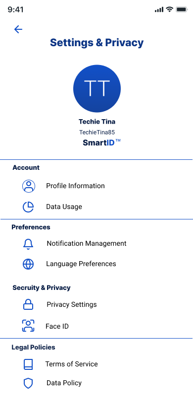
The Settings and Privacy Screen was similar to the home screen. Quite simple, but the profile pic took up quite a lot of space on the screen
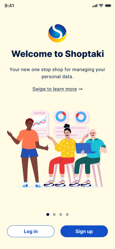
The Onboarding Section had a yellow background with colorful illustrations of people. This evoked a sense of fun and play, however, due to the nature of the product we wanted the app to read more as trustworthy and safe.
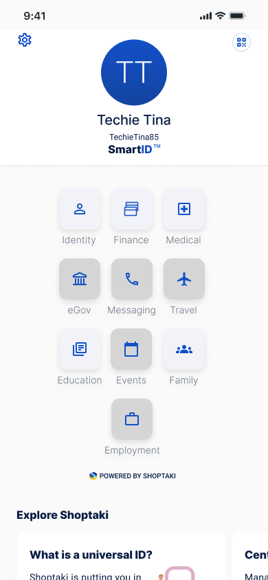
The Home Screen was relatively clean, however, the profile picture was using a lot of space, and the 3 X 3 buttons ended up looking like a phone keypad. There was also educational text at the bottom of the screen that seemed out of place
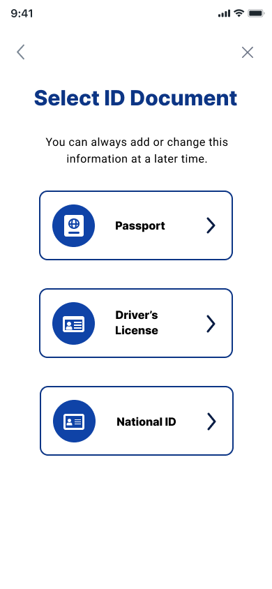
The Document Upload flow was clunky with big buttons and inefficient use of screen space.
The Finance Section was using a toggle system and bottom navigation bar that again was not used anywhere else in the app.
DESIGNING A BETTER PRODUCT
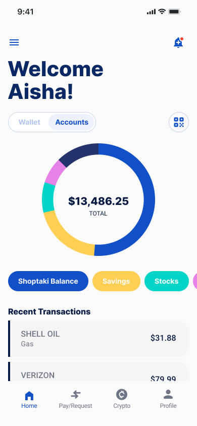
Now that we had the different pieces of the product, we began to figure out how to prioritize and organize all the content. The main issue was figuring out the best ways to structure the app’s various sections and features so that it was still easy to navigate for the user, but not overwhelming. We decided to start with the HOME SCREEN as it was foundational to the rest of the app.
The Key Elements the Client wanted to keep the same were
Square button interface
SmartID logo
QR Code
Username and Profile Picture
After discovering the QR code was a key feature of the product, we placed it front and center with the user profile. We cleaned up the homepage, rearranging the buttons into a 4 X 4 grid.
We also created one universal bottom navigation for the home app and added a drop-down menu on the home screen for subsections.
OLD DESIGNS


UPDATED DESIGNS


Once we had finalized the Home Screen and updated structure, we built out a cohesive style guide, to apply to the other sections. We kept the same strong blue color from the Shoptaki logo and used grey as an accent shade.

FINAL SMARTID REDESIGNS
Once we had applied our updated UI to the different sections of the prototype, we created videos to show how the user could navigate through the app.
Onboarding Flow
Finance Flow
Settings & Permissions Flow
Key Learnings
I learned so much while working on this project. Taking on other designers’ work, and also working with a client was super challenging, but very rewarding. The biggest takeaway I had while collaborating on this project, was the importance of communicating with your stakeholder and truly understanding the product. Because SmartId was very technical, it took multiple iterations to complete the redesign. Checking in with the CEO, sending updates and asking questions truly unlocked the best designs for us, and I really enjoyed working with other designers to solve this problem.